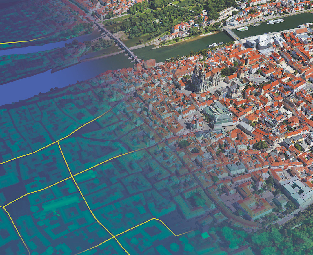
Big things are happening because of data and much more can still be done. Organisations are continuing to delve deeper into their data pool and are opening up new avenues by doing so. By unlocking the power of data visualisation, organisations can make their data go further and work harder than ever before.
The great thing about data is that it can be pulled from across different segments of an organisation or business. All that’s needed is a solid data set. At Leicestershire County Council, we’re using information from librarians to social workers to better understand and improve efficiencies and services. We don’t need to have an expert knowledge of each subject we’re looking at, we just need their data.
There are always ways to fast-track insight and understanding, and harnessing data visualisation is one of these. I recently spoke at Tableau’s customer conference about my experience of bringing data visualisations into Leicestershire County Council and below are my tips on how others can do it.
>See also: Why the editor of The Times kicked News UK’s big data chief out of his office
1. What’s the story?
Effective use of data within any organisation starts with story-telling. Exploration is important when starting out on the visualisation journey. But users need to recognise that the story won’t be clear until the data analysis is complete.
People know that they want to analyse their data but aren’t fully decided on the story they want to tell with it. This is where research comes in. Putting in some upfront work will really pay off – data teams will know about different business functions instinctively through everyday life, but delving further means the foundations of the story can be built and more solidly established later, when the data has been collected.
Following the R.E.A.D approach – research, explore, adapt and dive – helps to uncover your story. Exploring the data, being open and flexible in your thought process and remaining receptive to what can be found in a data set is key.
2. Make the time to get internal buy in
Getting in front of the right people is key to understanding and buying into the value of data visualisation within an organisation. However, this might not happen straight away. For example, it might be difficult to distinguish the right decision maker – the first person you speak to may not be the one you need! The best way to tackle this is to take it at face value that the first point of contact is likely the one who will be using the data analytics tools until otherwise identified.
The best data visualisation tools like Tableau are instinctive to use and there’s absolutely no need to be a data expert to gain deep insights and explore data sets with visualisations.
By taking the time to sit down with people, it’ll soon become clear whether or not they’re receptive to new options and have an open-mind towards change.
Perseverance is key. Once people begin to recognise the value, whole organisations can relish in the opportunities provided by visualisation.
3. Get on the same level with colleagues
Data experts might find resistance from other parts of the business – colleagues who believe their knowledge of that specific function is more extensive. This is perfectly natural. The important part is acknowledging and understanding this so teams feel supported in their journey to understanding how data visualisation can create better solutions.
Much of the time, people want to work with their own data, but aren’t aware exactly what they can do with it. Always take the view of assuming they know as much as you do and never be patronising. It’s important to be confident enough to sit down and comfortably talk about someone else’s data.
4. Don’t let data quality hold you back
Though it would be wonderful to always work with high quality data, it’s not always possible. It’s often the case that users have little or no control over the data provided. This can be down to a poor data collection process from a user point of view, or numerous other factors from a whole catalogue of data issues. Visualising data helps identify what is in fact good and can act as a springboard for people to clean up their data once they see what can be done with it.
Poor data quality is not an excuse for inaction. In fact, it’s a good reason to make it better, improve analyses and get the answers to those all-important questions.
If organisations are serious about data visualisation, they need a tool with instinctive prototyping which can answer the questions as quickly as they are raised. Visualisation has brought data to life across Leicestershire County Council – I’m looking forward to the additional stories it will unlock as we continue to explore its use.


